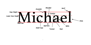
` CARP Poster for this project we used the carp method. Contrast, Alignment, Repetition, and Proximity. Contrast I used the white and the black stand out from the back round and pop out from the back round. I all so used different founts to so people could see form fare away. Alignment I used lift and right and center Repetion same fount and same color scheme. proximity spared out words in there own groups
Posts
Showing posts from November, 2017
logos color schemes
- Get link
- X
- Other Apps
This logo use the analogous color of green, yellow green, blue green. I think the company chose the colors these chose these color because it symbols life because there an oil commpny and there trying to have a good image. This Logo uses the analogus colors of red, red orange, and orang. I think the company probably chose these colors because there a travel company they what yo to feel warm and inviting. complementary This logo uses the complementary colors of red and green. I think the company probably chose these because the what to stand out with there bags. the are a non profitprofeit orgnastion
typography
- Get link
- X
- Other Apps
we learned what Shaffer and San-Shaffer is and what is formal and informer. and what the space between letters is. and what each little dealt is and what its about. and why comic sans is the best font in the world and how every one should use it and not use formal type face. we use it to learn why composes use fonts such as formal or informer lettings